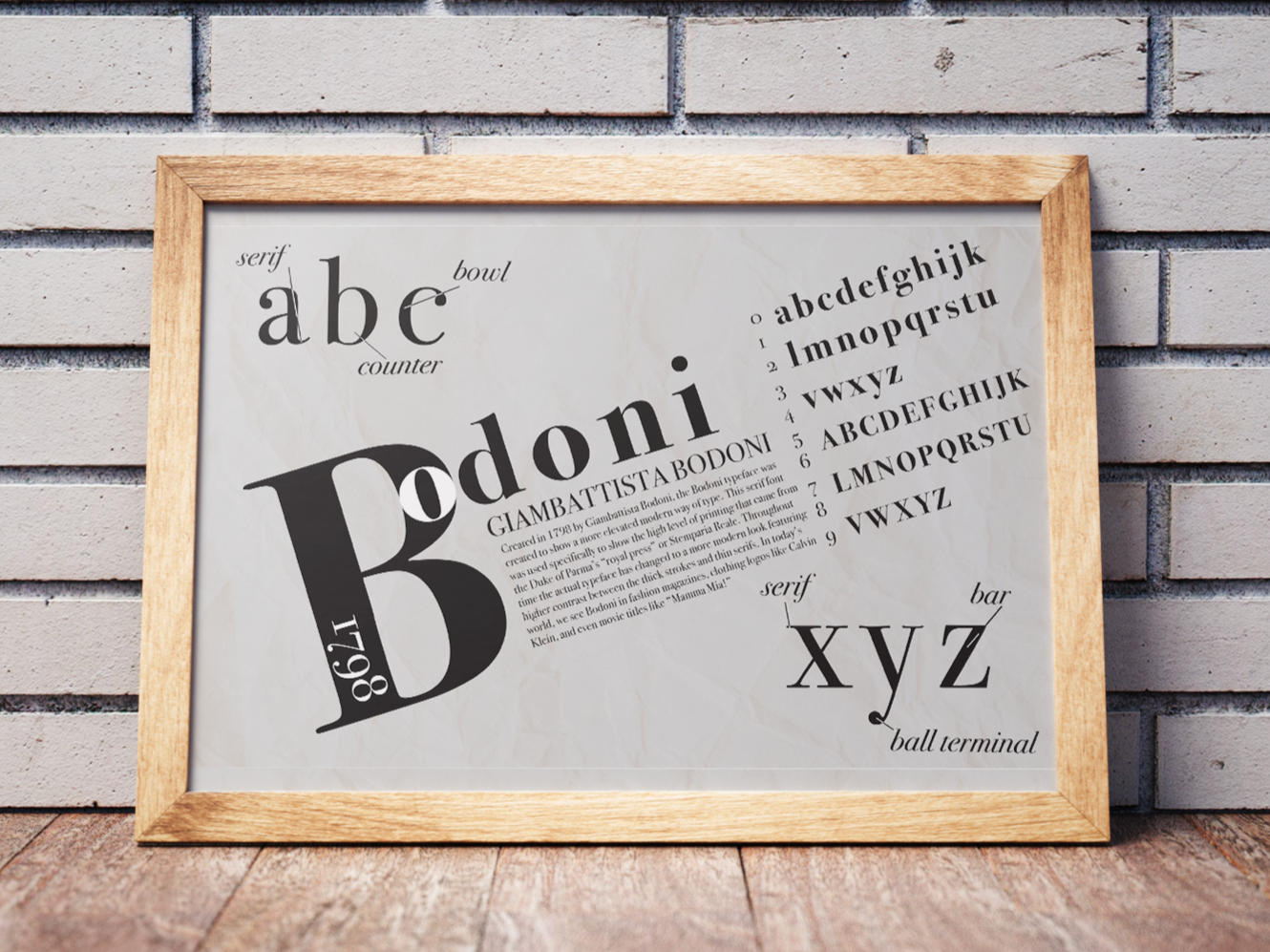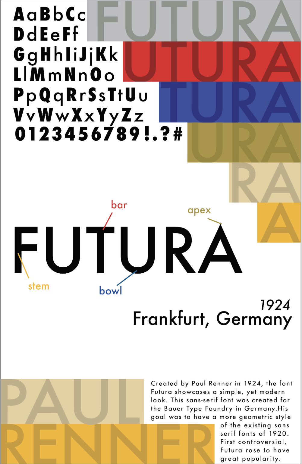
The goal of this project was to highlight two specific fonts and include the full alphabet, type anatomy, the name of the font, the name of the creator, and a brief summary of it’s history.
I chose the two fonts Futura and Bodoni. I chose these because each of the fonts is an icon for it’s respective category, either serif or sans-serif. Using Adobe Illustrator, I work-shopped several different layouts before landing on these final ones. The biggest challenge was fitting all of the needed information on an 11x17 space but things like grids and spacing helped tremendously.